Network utilization graph
The network utilization graph in the Compass dashboard consists of two interactive timeline graphs that allow you to view a specific area of interest. The top (larger) graph displays utilization over a selected time range, while the bottom graph displays utilization over the total time period. You will need to drag and select a time range in the top graph in order to display the bottom graph.
You can zoom into or out of the selected time range so that granularity is in milliseconds, seconds, minutes, hours, or days (initially the time range adjusts accordingly depending on how large of a capture needs to be displayed) by using the and controls (not available in real-time captures).
As you change the selected time range, the Data Source widgets will update accordingly to reflect the new period. See Compass dashboard viewing tips for additional information on using your mouse to navigate inside the network utilization graph.
TIP: For best results, it is recommended to zoom in on a selected time range until you can see the details of the area of interest.
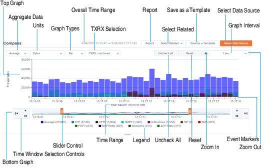
The parts of the network utilization graph are described below:
• Top graph: Displays network utilization as a line, scatter, bar, or area graph over a selected time range. Drag left or right inside the graph to select and display a specific time range (you can also use the bottom graph to select the time range). The selected data is then reflected in the bottom graph and also in the Data Source widgets at the bottom.
• Bottom graph: Displays network utilization as a line graph over the total time period. The bottom graph is always displayed if the top graph is not at full select, and always hidden if the top graph is at full select.
Use both the slider controls and time window selection controls to select a specific time range. The data for the selected time range is then reflected in the top graph and also in the Data Source widgets at the bottom.
• Overall Time Range: Displays the overall time range, from start date and time to stop date and time, of the trace file, capture, or forensic search.
• Report: (Omnipeek only) Saves the data currently displayed inside the Compass dashboard to an HTML report that can be viewed from inside a browser window, to multiple CSV files, or to a PDF file.
• Select Related: Filters packets related to selected items from the Data Source widget and from the time range currently selected in the network utilization graph. You will need to also select between AND or OR filtering logic when using Select Related (multiple items selected within the same Data Source widget will always use OR logic since AND logic will always nullify the entire expression, but items from different Data widgets will use the selected filtering logic). See also Select related packets.
• Save as a Template: Saves the contents of the current Compass display as a template so that it can be used again with other data sets. The type of widgets displayed, the location of the widgets, and the size of the widgets are retained in the template. You can select saved templates by clicking Select Data Source.
• Select Data Source: Enables/disables the Data Source widgets displayed inside the Compass dashboard. If any Compass templates have been saved, you can select them from here.
Each Data Source widget displays statistics appropriate to the selected data source and for the selected time range in the network utilization graph. The widget can be viewed as a List or Bar chart. See also Data Source widgets.
The available Data Source widgets include:
• Expert Events
• Protocols
• Flows
• Nodes
• Channels
• WLAN
• VLAN
• Data Rates
• Applications
• Countries
NOTE: For wired captures, the following Data Source widgets are not available: Channels, WLAN, and Data Rates. For wireless captures, the VLAN Data Source widget is not available.
• Aggregate Data: Allows you to display the Y axis in the top and bottom graphs, Data Source widgets, and legend as an aggregate of average, total, or maximum values:
• Average: In the top and bottom graphs, the average value for each time interval is graphed. In the various Data Source widgets, the average value for the statistic over the selected time range is graphed. If Bits, Bytes, Mbits, Gbits, Packets, or Retransmission Rate is the selected unit type, then average calculations include non-values; otherwise, non-values are not included in the calculations. Average calculations for Bits, Bytes, Mbits, Gbits, Packets, Signal Strength %, Noise Level %, and Expert Events are rounded to the nearest whole number.
• Total: In the top and bottom graphs, the total value for each time interval is graphed. In the various Data Source widgets, the total value for the statistic over the selected time range is graphed. If 2-Way Latency, Response Time, Signal Strength %, Signal Strength dBm, Noise Level %, Noise Level dBm, SNR, or Data Rate is the selected unit type, then Total values are unavailable.
• Maximum: In the top and bottom graphs, the maximum value for each time interval is graphed. In the various Data Source widgets, the maximum value for the statistic over the selected time range is graphed.
• Units: Allows you to set the unit type in the Y axis of the top and bottom graphs, Data Source widgets, and legend. Depending on the packet type and how they are aggregated, the available unit types include:
• Bits. Displays byte count in bits.
• Bytes. Displays byte count in bytes.
• Mbits. Displays byte count in Mbits.
• Gbits. Displays byte count in Gbits.
• Packets. Displays the packet count.
• 2-Way Latency. Displays 2-way latency. 2-way latency is the delta time between a request from the client, and a response from the server.
• Response Time. Displays response time. Response time is the delta time between a request packet from the client, and a response packet with data from the server.
• Signal Strength % (Wireless traffic only). Displays signal strength of the wireless data transmission, expressed as a percentage.
• Signal Strength dBm (Wireless traffic only). Displays signal strength of the wireless data transmission, expressed in dBm (decibel-milliWatts).
• Noise Level % (Wireless traffic only). Displays noise level reported of the wireless data transmission, expressed as a percentage.
• Noise Level dBm (Wireless traffic only). Displays noise level reported of the wireless data transmission, expressed in dBm (decibel milliWatts).
• SNR (Wireless traffic only). Displays Signal to Noise Ratio (SNR) of the wireless data transmission. Basically, it is a measure of signal strength relative to background noise.
• Data Rate (Wireless traffic only). Displays data rate of the wireless data transmission.
• Retransmission Rate (Wireless traffic only). Displays retransmission rate percentage of the wireless data transmission.
• Expert Events. Displays the total number of Expert events. Only the Expert events whose Event type severity button is enabled and are selected in the Expert Events Data Source widget are included in the count. If no Expert events are selected in the Expert event view, then all events whose Event type severity button is enabled are included.
NOTE: Selecting a unit type of Mbits or Gbits, and also selecting an aggregate value of Average, displays data in the graphs, Data Source widgets, and legend as a graph average, and not as the Average Utilization (bit/s). To see the Average Utilization (bit/s), click the Summary view under Statistics in the navigation pane of a capture window, and view the Network statistics.
• Graph Type: Displays the top graph as a line, scatter, bar, or area graph.
• TXRX Selection: Enables or disables graphing of both the inbound and outbound utilization values for the selected statistics (except for flows). The outbound values appear as a slightly lighter color than the inbound values in both the graphs view and legend. Inbound and outbound values are not available for the 2-Way latency mode, Response Time mode, and Expert Events mode.
• Uncheck All: Click to clear the check boxes of all the selected items in each of the Data Source widgets.
• Reset: Click to reset the Network Utilization Graph to its original state as if it was fully selected.
• Zoom In: For selected time ranges of a certain length, Zoom In (+ sign) is enabled and allows you to zoom into the selected time range so that you can increase granularity in milliseconds, seconds, minutes, hours, and days. You can hover the mouse over Zoom In to display a tooltip that contains the maximum time range that can be zoomed into. Selecting a time range less than or equal to it will enable Zoom In. (See also Graph Interval below).
For example, if the graph is in seconds with a one second average, you can zoom into milliseconds with a particular millisecond average; or, if the graph is in hours you can zoom into minutes. See the Graph Interval table below for more information as to what the graph interval will be for a particular time. Zoom In is not available in real-time capture mode.
For example, if the graph is in seconds with a one second average, you can zoom into milliseconds with a particular millisecond average; or, if the graph is in hours you can zoom into minutes. See the Graph Interval table below for more information as to what the graph interval will be for a particular time. Zoom In is not available in real-time capture mode.
• Zoom Out: Zoom Out (- sign) brings you back out of the previous Zoom In selection. Zoom Out is not available in real-time capture mode.
• Graph Interval: Graph Interval is the amount of time for each data point in the graph and is automatically adjusted based on the duration of the selected time range. The Graph Interval is updated according to the following chart:
Graph Interval | Maximum Time Duration |
|---|---|
1 millisecond | 1800 milliseconds |
50 milliseconds | 1.5 minutes |
250 milliseconds | 7.5 minutes |
500 milliseconds | 15 minutes |
1 second | 30 minutes |
5 seconds | 2.5 hours |
15 seconds | 7.5 hours |
30 seconds | 15 hours |
1 minutes | 1 day 6 hours |
5 minutes | 6 days 6 hours |
15 minutes | 2 weeks 4 days 18 hours |
30 minutes | 5 weeks 2 days 12 hours |
1 hour | 10 weeks 5 days |
6 hours | 64 weeks 2 days |
12 hours | 128 weeks 4 days |
1 day | 357 weeks 1 day |
2 days | 514 weeks 2 days |
4 days | 1028 weeks 4 days |
(doubles)... | (doubles)... |
NOTE: The graph interval chart is also valid for determining the minimum and maximum ranges of time that can be zoomed into when viewing capture files. See also Zoom In above.
Additionally, millisecond graph intervals are not automatic and only occur during Zoom In and are not valid for live captures.
Additionally, millisecond graph intervals are not automatic and only occur during Zoom In and are not valid for live captures.
• Event Markers: Indicates triggered Expert events in the selected time range. The event markers are color coded to the Expert event severities displayed in the Expert Events Data Source widget.
• Time Range: The time range indicator below the X axis of the top graph indicates the duration of the currently selected time range. Use the arrow and slider controls to adjust the selected time range.
• Time Window Selection Controls: The single arrow and double arrow selection controls allow you to move the selected time range in the top and bottom graph left or right in one unit increments (single arrows) or in increments of the entire selection (double arrows). The single arrow with a line selection control allows you to move the selected time range in the top and bottom graph all the way to the left or right.
• Slider Controls: The two slider controls allow you to widen and narrow the selected time range in the top and bottom graph. In a real-time capture, the slider controls work as follows:
• If the left and right sliders are pushed all the way to the left and right (respectively), new data is displayed on the right as it becomes available, and old data on the left remains. Thus, the duration of the selected time range continuously increases.
• If the left and right sliders are not pushed all the way to the left and right (respectively), new data is not displayed on the right as it becomes available, and old data on the left remains. Thus, the duration of the selected time range is maintained.
• If the left slider is pushed all the way to the left but the right slider is not pushed all the way to the right, new data is not displayed on the right as it becomes available, and old data on the left remains. Thus, the duration of the selected time range is maintained.
• If the left slider is not pushed all the way to the left but the right slider is pushed all the way to the right, new data is displayed on the right as it becomes available, and the old data is removed from the left. Thus, the duration of the selected time range is maintained.
TIP: You can drag the area between the slider controls left or right to select different parts of the top and bottom graph.
• Legend: Displays a legend of the graphed items. The values in the legend are displayed as a total, average, or maximum depending on what is selected in the Aggregate Data drop-down list. Click the color boxes in the legend to show or hide entries from the graphs.
• Pause/Play (real-time capture only): Toggles between updating and not updating the graphs in real time.